Tuesday 29 January 2013

100s & 1000s

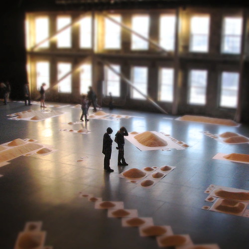
Whilst researching artists linked to Data I learned about an exhibition put on by the Stan's Cafe Theatre Company called "Of All The People In All The World"
When trying to come up with ways of visually representing the data from my receipts my mind kept coming back to the rice in this exhibition. And then I thought of using 100s & 1000s. I liked how they were all different colours and thought they would be fun to work with. So since then I have undertaken a series tests to see what could be done with them. 

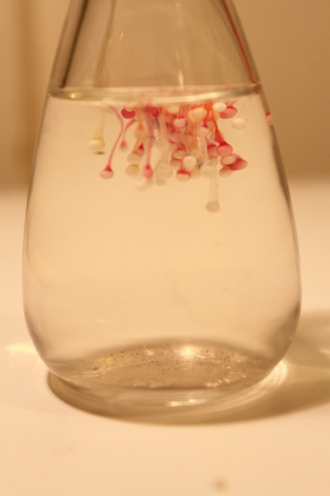
Dropping them into a bowl of water
Straight away the colours started to run and bleed into one another. 

Dropping even more into water
I think this looks really interesting. It looks quite strange at first but the pattern the colouring has formed looks really good.

 Dropping them onto wet receipts
Even without alot or moisture the colours still run anf the 100s & 1000s even begin to dissolve.

Dropping into clear glue
I love how the thickness of the glue allows the 100s & 1000s to sink really slowly and leaves a trail of colouring on the way down.

I am going to incorporate some of these qualities into my weave samples and well as drawing from them. I also want to do some embroidery.

Friday 25 January 2013

Weave Workshop Week 2

I have had a really productive week and have made great progress with my weave samples. We had a taught  workshop with Lesley on Tuesday, where we were shown how to do a basic weave pattern and were provided with a selection of weave patterns to experiment with. 

Then on Wednesday we were inducted to the Dye Lab where we were taught how to treat yarn with Direct dye. I decided to mix a purple shade 5:3 red and blue. It turned out a light plum colour which I am really pleased with and will include it in my weave sample next week. The bright green colour is the example Colin the technician was using but he said I could keep it. I will have a go with this in my weave too.


I now have 2 complete samples and am half way through my 3rd. I have mainly been experimenting with colour and weight of yarn. Here I have incorporated small snaps of bright yellow cotton to see how it contrasts with my original palette. I am really pleased with the result and would like to work more of this yarn in to another sample. I have also experimented with bright coral and ocean blue cotton and mustard yellow wool.

Here are the yarns I have ready to experiment with next week. The far right is copper wire.


Wednesday 23 January 2013

Weave Workshop Week 1

From my 8 colors I chose 3 to work with in my first warp. The warp is the part of the weave that stayes still, pulled very tight on the loom whilst you weave side to side with the threads that make to weft.
 First you have to measure out the yarn on a the mill. There is alot of counting involved.


Then you have to move the warp onto the loom and separate even sections which were measured out on the mill.
 Then you have to thread each each strand of yarn through a heddle. The pattern in which you do this will vary depending on your design but as it's my first sample I went with block threading.

After this you then have to thread each piece through the comb which keeps all the yarns in order.
This whole process took a few days but once this is done the actual weaving process is alot quicker. I don't know how much of this I will remember for next time but I know the more I do it, the easier it will become.


Colour Palette

To create a colour palette we were asked to blow up small scetions of our moodborads and pain them out in 12x12 squares. I decided to use gouache paints as I had really enjoyed working with these in the last unit and wanted clear, block colour to choose from.

When we started back at uni I then matched my colours to yarns. With the coral I had found a perfect match but it was a thicker than the rest of my yarns so had to go with peach instead. I am really pleased with my overall palette, it is really vibrant and cheerful. However Lesley has suggested experimenting with blends as so that my yarns don't over power each other.

Tuesday 22 January 2013

Receipt Data

So whilst trying to think of a source of data for the project I realised that I conveniently keep all of the food shop receipts so that me and my boyfriend can split the amount spent.

There are loads of pieces of data within a receipt such as
Name of shop
Shop location
Total Spent
Number of items bought
Time and date of shop
Discounts/offers
Vouchers
Reduced items
Frequency of individual items
   Type of payment
Item codes

I think the data that interests me the most is the name of shop, shop location and total spent. But am I thinking to literally with the concept of data???
And how can I translate my ideas into construct???

Moodboard Inspiration

For the Sampling unit I am doing Construct which consists of knit and weave. Over the Christmas break we were asked to put together a moodboard and select a colour palette. As I didn't have any work from the Data brief to inspire me I decided to use a selection of photographs I had taken on my phone of sunsets. After thinking about it I suppose they can also be seen as data. 


I really love looking at these photos, the colours are so beautiful, and I find it amazing that such vibrant, exciting colours can be found in nature.
I collected images of things containing similar colours to those found in the sunset photos, such as coral, flowers, birds, eye make-up, hair and advertisements. I like how some of these things are found in nature, and yet produce the same beautiful, vibrant colours as the man made objects. I also used scraps of fabrics, ribbon, paper and feathers.
I am really pleased with the overall feel of the moodboard. It feels really bright and cheerful, just what I need in January.

4th December Sampling Unit Launch- DATA

The unit was launched 2 weeks before we broke up for Christmas for 4 weeks and we were shown a wide array of artists to inspire us and get some ideas flowing.
Some of the artists that I found interesting were:
IRWIN GLUSKER
TOM HACKNEY
HARRY BECK
EVA HESSE
CASUAL DATA
SHAHEE ILYAS
ETIENNE-JULES MAREY
ON KAWARA
SAM VAN DOORN
ANDY WARHOL
SUSAN MORRIS

All the the artists listed display data visually. Whether it be that of movement, time, colour, connections or a story. At first I felt a bit daunted by the word DATA as a starting point for a brief, but after seeing some examples and researching them further, the word DATA is just a term used for collected/recorded information. I am going to be as open as I can to different possibilities/directions/ideas as to not confuse and confine myself as I did in the last project, 

First Cut Exhibition

Just before Christmas I visited 'First Cut', a paper exhibition at Manchester City Gallery. I was really impressed by the work displayed. The difference in techniques and subjects between the artists exhibited was really vast considering the main material used was paper. I really liked the 3D work of Sarah Bridgland. The scale, intricacy and detail in her work was amazing. She is able to create a miniature world for the viewer to become part of.
 The Pier, Sarah Bridgland.

It was nice to see the majority of the work exhibited, free from the confinements of a frame or canvas. Claire Brewster's display of paper birds covering the wall is a perfect example of this. I felt that this way of displaying made the piece feel a lot more interactive.
 The Harbingers, Claire Brewster.

Another technique used by a few of the artists is using books as a platform for creating art with paper. Su Blackwell is well known for this style of working and I found her work really magical to look at. 
Wuthering Heights, Su Blackwell.

The whole exhibition really inspired me and I would like to have a go at incorporating paper into my work as it has such potential to be used in many different ways.